
NativeWind React Native Expo Tutorial: Reusable UI Components with Practical Examples
a.className in NativeWind vs Tailwind CSS
2.Typography in NativeWind
3.Layout, Flexbox, Sizing in NativeWind
4.Backgrounds, Borders, and Effects in NativeWind
a.Creating an avatar
b.Creating a custom button
5.Conditional Styling in NativeWind
6.Complete NativeWind Expo UI Example
What's NativeWind in React Native?
NativeWind brings the utility-first approach of Tailwind CSS to React Native, allowing you to style components using familiar className utilities in Expo applications. Instead of providing pre-built UI components, NativeWind makes it easy to create your own interface elements with concise, reusable styles while working with standard React Native components.
In this article, you'll explore practical NativeWind examples built with Expo. Rather than covering installation or configuration, the focus is on real-world styling patterns used in everyday React Native development.
You'll learn how to build layouts, style text, create cards with images, design custom buttons, display avatars, apply conditional styling, and switch background colors using NativeWind.
Whether you're getting started with NativeWind or looking for inspiration for your next Expo project, these examples will help you build clean, modern mobile interfaces with less styling code and a more maintainable workflow.
The examples in this article are based on NativeWind v4 and tested with Expo SDK 54 and Expo SDK 56. If you haven't set up your project yet, make sure to follow the Expo setup and installation guide before continuing. If you're using or planning to use NativeWind v5, check out my complete NativeWind v5 guide.
If you're new to NativeWind, check out the installation and configuration guide for setting up NativeWind with Expo before continuing.
className in NativeWind
The className prop is the core feature of NativeWind in Expo and React Native applications. It allows you to style components using Tailwind CSS utility classes instead of traditional React Native StyleSheet objects.
With NativeWind, you can apply multiple styles directly inside the className attribute, keeping your UI code clean and close to the component structure. This makes it easier to build and maintain layouts, typography, and visual styles in React Native apps.
className in NativeWind vs Tailwind CSS
In Tailwind CSS (used for web development), styles are applied using the class attribute in HTML. However, in React and React Native, styling is handled differently. NativeWind adapts Tailwind CSS utility classes for React Native by using the className prop instead of class. This is because React uses className as the standard way to define CSS-like classes in JSX.
Typography in NativeWind
Typography in NativeWind for Expo applications controls how text appears in React Native interfaces using Tailwind CSS utility classes. It helps you define font size, weight, color, alignment, and spacing directly within the className prop, without needing separate style objects.
NativeWind provides a wide range of text utilities that make it easy to build clear visual hierarchy in mobile apps. For example, classes like text-2xl, font-bold, and text-slate-900 are commonly used for headings, while text-base and text-slate-600 are used for body text.
You can also control alignment and spacing using utilities such as text-center, leading-relaxed, and tracking-wide, which help improve readability in React Native layouts.
By combining these typography utilities, you can create consistent and readable text styles across your Expo app while keeping your styling simple and maintainable with NativeWind.
<Text className="text-pink-500 text-lg font-bold text-center"> ..... </Text>
In text-pink-500, pink is the color family and the 500 represents the shade intensity of the color in the Tailwind (and NativeWind) color scale.
Layout, Flexbox, Sizing in NativeWind
Layout in NativeWind for Expo applications is built on React Native's Flexbox system, enhanced with Tailwind CSS utility classes. This allows developers to structure and align components without manually writing style objects.
Flexbox utilities control how elements are arranged inside a container. Classes like flex, flex-row, and flex-col define layout direction, while utilities such as items-center, justify-center, and justify-between handle alignment and spacing.
Sizing utilities in NativeWind help define how components scale within a layout. Classes like w-full, h-screen, w-1/2, or fixed spacing values such as h-16 and w-32 allow you to quickly control width and height in a consistent way across Expo apps.
Together, layout, flexbox, and sizing utilities make it easier to build responsive and structured user interfaces in React Native using NativeWind.
<View className="h-16 w-full flex-row items-center justify-between px-4 bg-white rounded-xl">...</View>
• h-<number> sets the element's height using Tailwind's spacing scale
• w-full makes the element take the full width of its parent container
• flex-row sets the flex direction to row, arranging children horizontally
• items-center aligns children vertically in the center (cross-axis alignment)
• justify-between places items at the start and end with space distributed between them
• px-4 adds horizontal padding using Tailwind's spacing scale
• bg-white sets the background color to white
• rounded-xl applies a large border radius for rounded corners
Backgrounds, Borders, and Effects in NativeWind
NativeWind makes it easy to style backgrounds, borders, and UI effects in React Native using Tailwind CSS utility classes in Expo applications. These utilities help you quickly build visually structured interfaces without writing separate style objects.
Background utilities define the base appearance of a component. Classes such as bg-white, bg-slate-100, or bg-blue-500 are commonly used to create contrast between screens, cards, and interactive elements in mobile layouts.
Border utilities help separate and structure UI components. You can apply borders using border, control thickness with classes like border-2, and adjust color with utilities such as border-slate-200 or border-gray-300. Rounded utilities like rounded-lg and rounded-xl are often used to create modern, soft-edged designs in React Native apps.
Effects add depth and visual hierarchy. Shadow utilities like shadow, shadow-md, and shadow-lg help elevate components above the background, especially in card-based layouts. Opacity utilities such as opacity-50 and color modifiers like bg-black/50 are useful for overlays, modals, and disabled states.
Together, these utilities make it easier to build clean, modern, and consistent user interfaces in Expo using NativeWind.
Creating an Avatar with NativeWind
Avatars are commonly used to represent users in profiles, navigation menus, chat applications, and comment sections. While NativeWind doesn't provide a built-in avatar component, you can easily create one by styling React Native's Image component with utility classes. The most common avatar styles use equal width and height values, such as w-16 and h-16, together with rounded-full to create a circular shape. You can further customize the avatar by adding borders, background colors, or spacing utilities to match the design of your Expo application. By combining sizing, border, and layout utilities, NativeWind makes it simple to create consistent, reusable avatars that integrate seamlessly with the rest of your React Native interface.
<Image source={require("..")} className="w-24 h-24 rounded-full border-2 border-pink-300" resizeMode="cover" />
Creating a Custom Button with NativeWind
Buttons are one of the most frequently used interactive elements in mobile applications. Although NativeWind doesn't include pre-built button components, it enables you to create fully customized buttons by styling React Native components such as TouchableOpacity or Pressable using utility classes.
A typical button combines background colors, padding, rounded corners, and typography utilities to create a clear visual appearance. You can also use conditional styling to change the button's colors or opacity based on its state, such as active, disabled, or selected.
Since buttons are built from standard React Native components, you have complete control over their appearance and behavior while benefiting from NativeWind's concise, utility-first styling approach. This makes it easy to create reusable button components that maintain a consistent look and feel throughout your Expo application.
<Text className="text-white font-semibold shadow-200"> Press Me </Text>
Conditional Styling in NativeWind
In many React Native applications, a component's appearance changes based on its state or user interaction. NativeWind makes this easy by allowing you to apply different utility classes conditionally through the className prop. Instead of creating multiple style objects, you can dynamically switch between utility classes to reflect different states, such as active, inactive, selected, disabled, or focused. This approach keeps styling logic close to the component, making it easier to read and maintain. Conditional styling is commonly used for buttons, navigation items, badges, cards, and form controls. For example, a selected button might use a different background color, while a disabled button can reduce its opacity to indicate that it cannot be pressed. By combining React Native state with NativeWind utility classes, you can create responsive, interactive interfaces with minimal styling code in your Expo applications.
<Text className={`mt-3 text-lg font-bold ${isDark ? "text-pink-300" : "text-pink-500"}`} > Change </Text>
Complete NativeWind Expo UI Example
Now that you've explored the core NativeWind concepts, it's time to see how they work together in a complete React Native screen. The following example combines the techniques covered throughout this article, including NativeWind layout, typography, backgrounds, borders, sizing, custom components, and conditional styling. Rather than demonstrating each utility in isolation, this example shows how NativeWind can be used to build a clean, reusable interface for an Expo application. As you review the code, notice how the utility classes work together to create a structured, maintainable UI without relying on large StyleSheet objects. Use this example as a starting point for your own projects, and customize the colors, spacing, and components to match your application's design.
import { useState } from "react";
import { Image, Text, TouchableOpacity, View } from "react-native";
import "global.css";

export default function App() {
  const [isActive, setIsActive] = useState(false);
  const [isDark, setIsDark] = useState(false);

  return (
     <View
      className={`flex-1 justify-center items-center  p-4 ${isDark ? "bg-rose-100" : "bg-white"}`}
    >
       <TouchableOpacity
        className="mb-6 rounded-xl bg-rose-300 px-6 py-3 mt-5 border-b-4 border-rose-400 border-r-4 border-rose-400"
        onPress={() => setIsDark(!isDark)}
      >
         <Text
          className={`mb-2 text-white ${isDark ? "font-normal" : "font-bold"}`}
        >
          Change the Vibe
         </Text>
       </TouchableOpacity> {/*Change the Vibe Button - Conditional Styling*/}

       <Text className="text-xl font-bold mb-4 text-pink-300">
        Hello Baby Girl!
       </Text>

       <Image
        source={require("../../assets/images/babyT.jpg")}
        className="w-24 h-24 rounded-full border-2 border-pink-300"
        resizeMode="cover"
      /> {/* Avatar */}

       <View className="items-center mt-6">
         <Text
          className={`mt-3 text-lg font-bold ${isDark ? "text-pink-300" : "text-pink-500"}`}
        >
          Baby Girl
         </Text>
         <Text className="text-gray-500">React Native Developer </Text>
       </View>

       <View className="rounded-2xl overflow-hidden border border-pink-200 mt-4 pt-6 shadow-md ">
         <Image
          source={require("../../assets/images/holiday.jpg")}
          className="w-32 h-36 rounded-2xl border border-pink-300 m-auto"
          resizeMode="cover"
        />
         <View className="p-4">
           <Text className="text-pink-500 text-lg font-bold text-center">
            Last Summer
           </Text>
           <Text className="text-gray-500 mt-1 text-center">
            Your favourite place
           </Text>
         </View>
       </View> {/* Card with Image */}

       <Text className="text-blue-500 font-semibold italic mt-4">
        Only good vibes!!!
       </Text>

       <TouchableOpacity className="rounded-l bg-blue-400 px-6 py-3 mt-5 border-b-4 border-blue-200 border-r-4 border-l-4 border-t-4 ">
         <Text className="text-white font-semibold shadow-200">
          Add a new photo
         </Text>
       </TouchableOpacity> {/* Add a new photo button */}

     </View>
  );
}
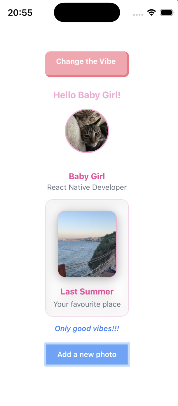
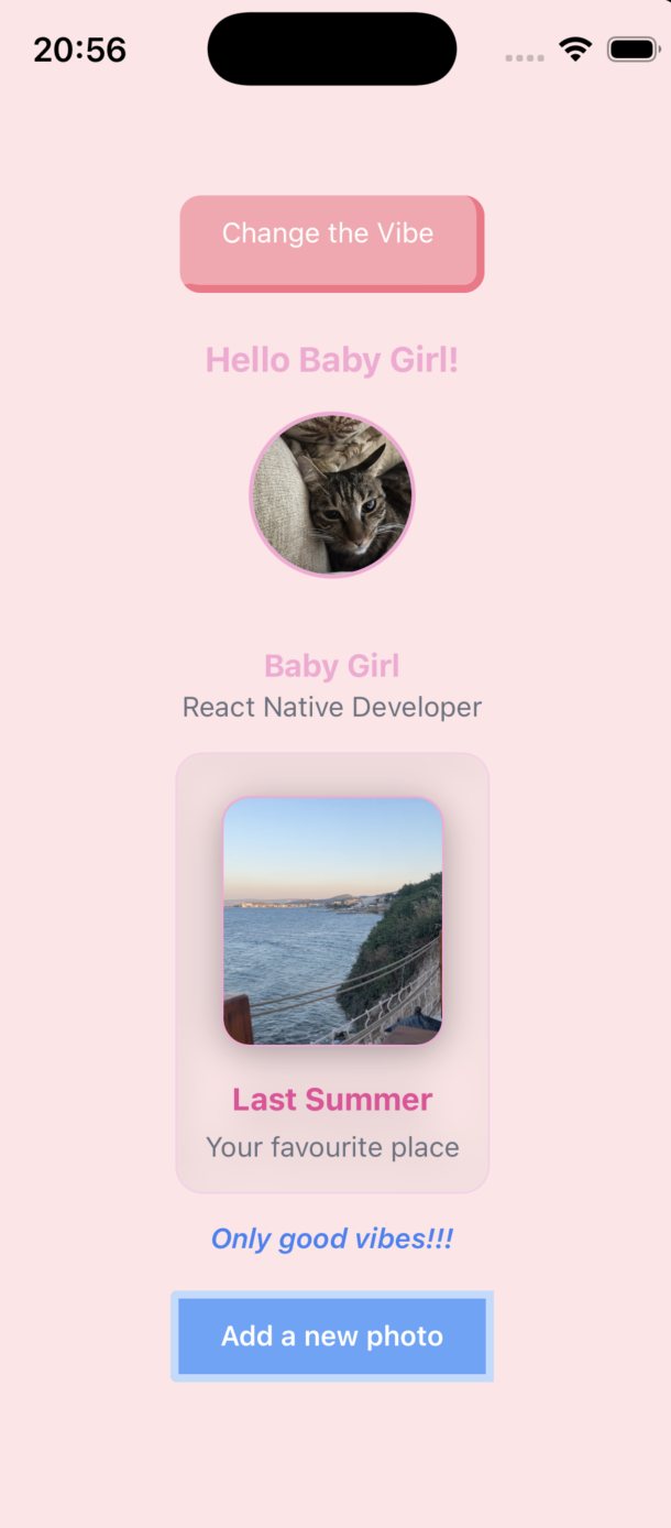
When you press the "Change the Vibe" button, the interface styling changes dynamically.
For more advanced usage and configuration options, you can refer to the official NativeWind documentation.
You can explore more articles about Expo to dive deeper into building modern React Native applications.