
Expo Tutorial 2026
2.React Native vs Expo
3.Installing Expo
4.Expo environment setup
5.React Native Expo app with core components
6.Style
7.useState Hook
8.Expo Image Picker library
9.Expo Vector Icons
a.Expo Vector Icons example
10.Expo - React Native Paper
a.React Native Paper and React Native Vector Icons example
b.React Native Paper Icons, IconButton, Button
11.Expo - React Native Elements
a.Airbnb Rating, Search Bar, Avatar, Pricing Card, Social Icon examples
12.React Navigation Library with Expo
Advanced Topics
How to Fetch Data in Expo Using Fetch API and AxiosReact Native Gesture Handler Library
React Native Reanimated Library
React Navigation with Expo Router (2026): Stack, Tabs, Nested Routes, and Drawer Guide
Expo Local Notifications in 2026: Schedule Alerts and Handle Permissions on iOS & Android
The Ultimate Guide to Expo Push Notifications and Firebase Cloud Messaging (FCM) on Android
How to use this tutorial
In this tutorial, you'll learn how to build a React Native app using Expo. If you'd prefer to build the same app without Expo, you can always visit the React Native page. To set up your React Native Expo environment and install the necessary packages, you just need to follow the steps below. If you need more information, you can always visit the offical Expo website. This tutorial covers the fundamentals and some important React Native Expo libraries, then progresses into more advanced sections; for readers who want to go even deeper, additional topics, including advanced React Native libraries, are explored in separate articles.
Expo Tutorial 2026
"Expo is an open-source platform for making universal native apps for Android, iOS, and the web with JavaScript and React." Expo simplifies and accelerates React Native app development. A foundational knowledge of JavaScript and React is recommended before proceeding.
React Native vs Expo
Both Expo and React Native have advantages and disadvantages. The choice depends on your circumstances. Expo is easier to use than bare React Native, and it can be a better choice for beginners. For example, setting up the React Native environment and using Xcode can be difficult for beginners. On the other hand, React Native can give you more freedom and perform better. Please visit the React Native page for a more detailed comparison.
Installing React Native Expo
You need NodeJS and Watchman for Expo.
To create a new project, run the command below:
npx create-expo-app --template
You can also create it by writing your project's name instead of "--template":
npx create-expo-app FirstProject
The Expo CLI is the command line tool that is the primary interface between developers and other Expo tools. To see all available commands in Expo CLI, run the following command:
npx expo -h
React Native Expo environment setup
If you installed one of the latest versions of Expo, you can skip the following steps. However, if you are using an old version of Expo, you need to install the following dependencies.
To run the app on the web, install the following dependencies:
npx expo install react-dom react-native-web @expo/webpack-config
If you don't install react-dom, react-native-web, @expo/webpack-config, you can't run your Expo app on the web.
How to run an Expo app on mobile and web
To start a development server, run the command below:
npx expo start
You can install the Expo Go app and scan the code for running the app on your phone.
If you have iOS or Android simulator, you can test your app there.
You can also use Expo Snack online without any installation.
The default template of Expo is TypeScript. If you want to use JavaScript, just rename the files with js extension.
React Native Expo App with core components
You can visit the bare React Native page for an Expo App with basic components. As it's a simple React Native app with core components and Expo libraries are not used, you can use the same code for both Expo and React Native.
Style
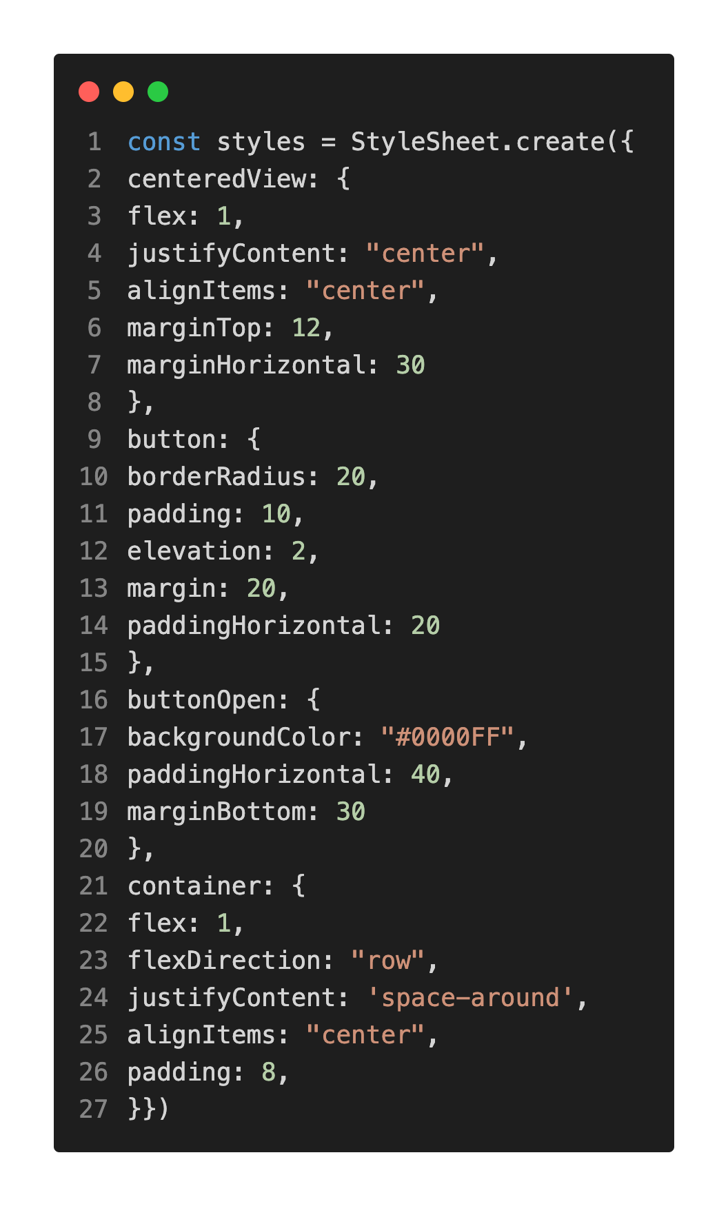
There are two ways to style components in Expo. First option is to use style prop as in the example below. You can write style prop inside the component you want, you just need to add style name and the value.
Second option is to create a StyleSheet. You can also import and export StyleSheet.
useState Hook
useState is a React Hook that adds a state variable to function components and helps state management. You can read the example. You need to import useState from React:
import React, {useState} from 'react'
In addition to strings and arays, you can also use useState for images. Although the initial state is empty in the previous example, you can also specify an initial state:
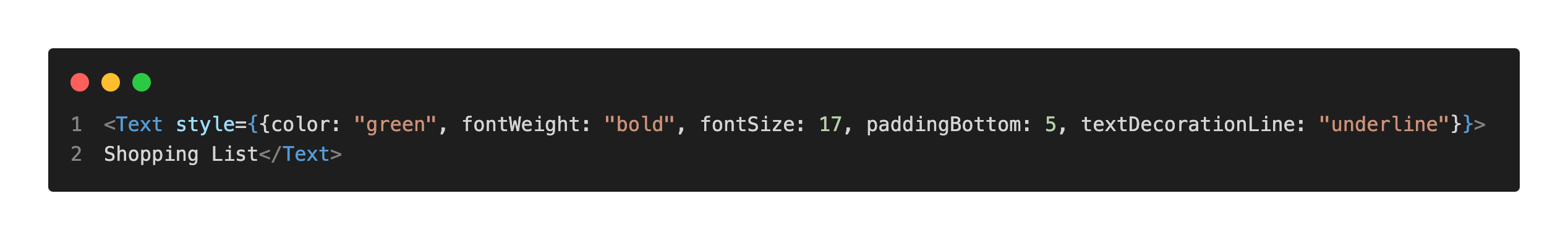
const [list, setList] = useState(["tea"])
You should finally write a function to change the state, Submit() and Delete() functions are used in the example above. Thanks to TextInput, users can write the item. FlatList displays the items stored in the list.
Expo Libraries
Expo SDK has great core libraries. You need to install the libraries and check if they require additional configuration. You should always check platform compatibility; a library can be compatible with iOS devices but can not be compatible with web applications. This tutorial shows how to install, set up, and use the Expo Image Picker library and Expo Vector Icons in a React Native project using Expo.
expo-image-picker library
The expo-image-picker library enables users to choose images or videos from their photo library. The expo-image-picker 16.0.4 is used in the tutorial and examples below. If you use a different version, settings and methods may be different. You need to install the expo-image-picker library first with the following command:
npx expo install expo-image-picker
expo-image-picker library Permissions
To request camera and photo library permissions on iOS, you must specify usage descriptions in the infoPlist section of your app.json configuration file. See the example configuration below for reference.
"infoPlist": {
"NSCameraUsageDescription": "Allow access to your camera to take photos.",
"NSPhotoLibraryUsageDescription": "Allow access to your photo library to choose images."
},
Expo image picker library permissions
You should also add permission settings for plugins. See the example configuration below for reference.
"plugins":
["expo-image-picker",
{"photoPermission": "The app needs to access your photo library.",
"cameraPermission": "The app needs access to your camera."
}]
Request Media Library Permissions
You need to request permission to access the user's library. The requestMediaLibraryPermissionsAsync() method asks the user to grant permissions for accessing the user's photo library. You can't use requestMediaLibraryPermissionsAsync() on the web.
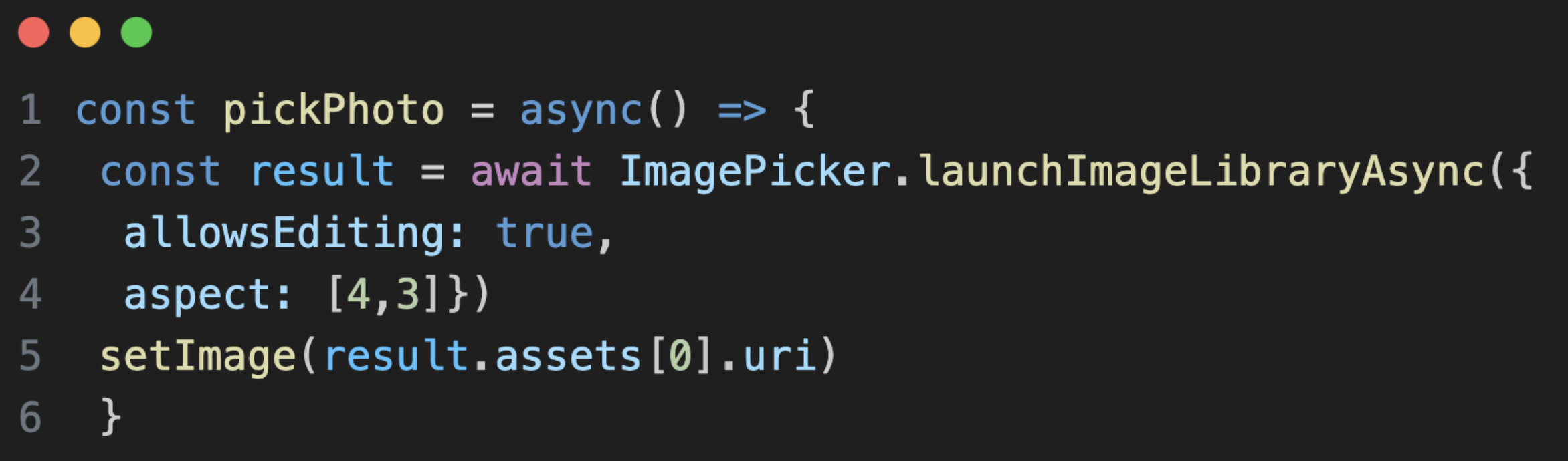
Open library and choose photo(s)
After giving permission, users can open their library and choose photos or videos. The launchImageLibraryAsync() method displays the system for users to choose a photo or a video from the phone's library.
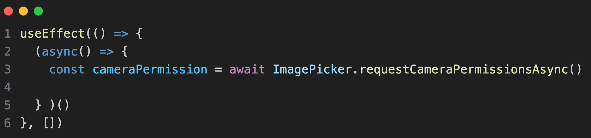
Request Camera Permissions
You need to request permission to access the user's camera. The requestCameraPermissionsAsync() asks the user to grant permissions for accessing the camera.
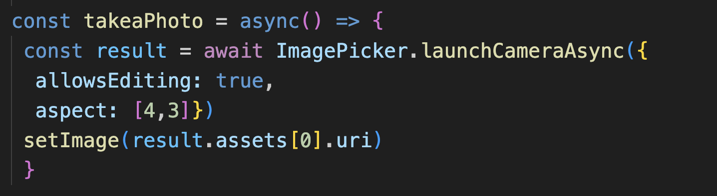
Take a photo
After giving permission, users can take a photo. The launchCameraAsync() method displays the system for users to take a photo.
expo-image-picker example
import { FontAwesome } from '@expo/vector-icons';
import React, { useEffect, useState } from 'react';
import { Button, Image, Text, View } from 'react-native';
import * as ImagePicker from 'expo-image-picker';
export default function HomeScreen() {
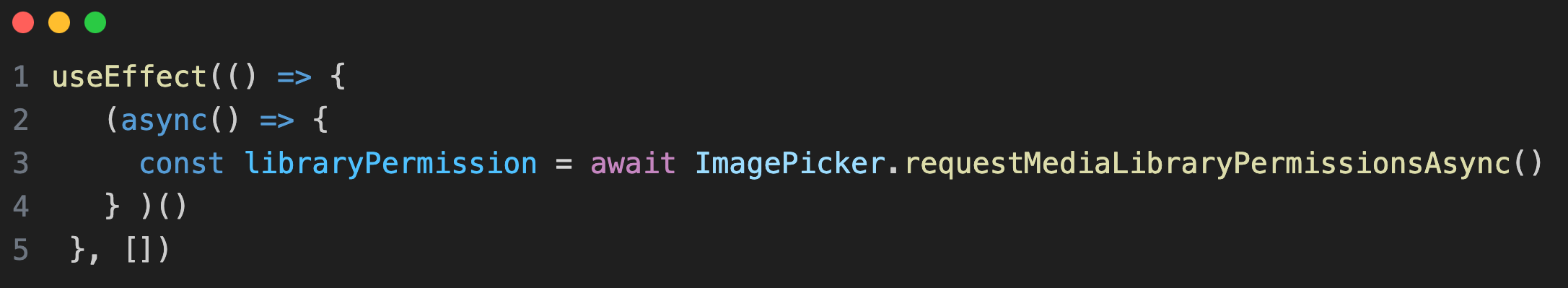
useEffect(() => {
const requestPermissions = async () => {
const libraryPermission =
await ImagePicker.requestMediaLibraryPermissionsAsync();
const cameraPermission =
await ImagePicker.requestCameraPermissionsAsync();
console.log(libraryPermission);
console.log(cameraPermission);
};
requestPermissions();
}, []);
const [image, setImage] = useState([""])
const pickPhoto = async() => {
try{ const result = await ImagePicker.launchImageLibraryAsync({
allowsEditing: true,
aspect: [4,3]
})
console.log(result)
if(!result.canceled){
setImage(result.assets[0].uri)}
}
catch(error){
console.error("Image picker error: ", error)
}
}
const takeaPhoto = async() => {
const result = await ImagePicker.launchCameraAsync({
allowsEditing: true,
aspect: [4,3]
})
console.log(result)
if(!result.canceled){
setImage(result.assets[0].uri)}
}
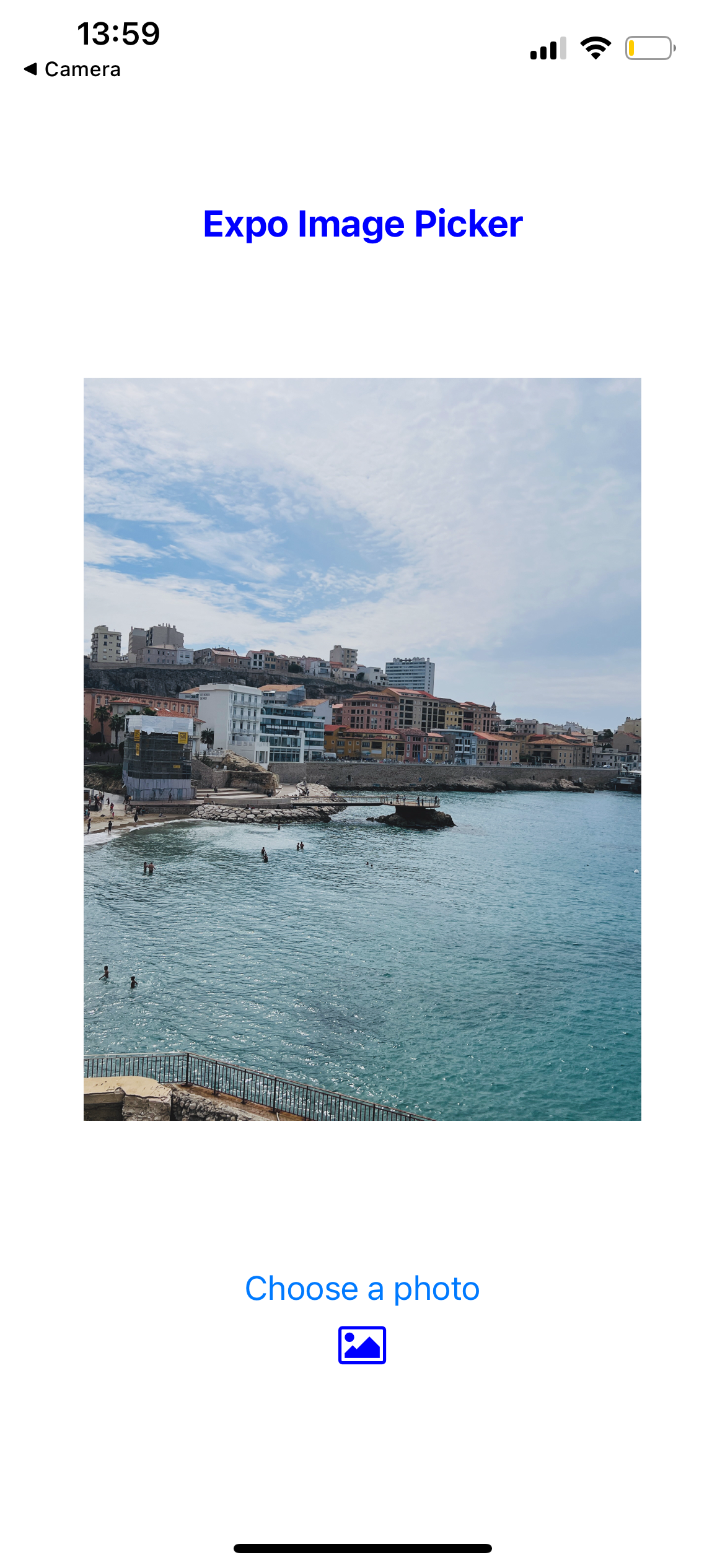
return (
<View style={{flex:1, justifyContent: "center", padding: 8}}><Text style={{textAlign: "center", marginTop: 100, color: "blue", fontSize: 20, fontWeight: "bold"}}>Expo Image Picker</Text>
{image && <View style={{margin: "auto"}}><Image source={{uri: image}} style={{width: 300, height: 400}} /></View>}
<Button onPress={pickPhoto} title="Choose a photo" /><Button onPress={takeaPhoto} title="Take a photo" /><FontAwesome name="photo" style={{textAlign: "center", marginBottom: 100}} size={24} color="blue" /></View>
);
}
You can find the complete Expo app folder here.
You can use the code above for iOS and the Web apps.
You can use Firebase Storage to store photos selected with Expo Image Picker. For a complete example, check out the Firebase integration page on this site, which covers using expo-image-picker with Firebase Storage.
If you want to learn other expo-image-picker methods, you can visit the official Expo website.
You can learn how to use Expo Vector Icons in the following section.
Expo Vector Icons
You can use @expo/vector-icons for your Expo icon needs. @expo/vector-icons library offers very nice Expo icons and the library is easy to use. @expo/vector-icons is installed by default, you don't need to install it. It's similar to react-native-vector-icons.
How to use @expo/vector-icons
You need to import the icon family you want:
import { AntDesign, FontAwesome, Entypo } from '@expo/vector-icons';
A sample component to add an @expo/vector-icons icon:
<FontAwesome name="photo" size={24} color="green" />
<AntDesign name="bars" size={24} color="blue" />
<AntDesign name="paperclip" size={24} color="grey" />
<Entypo name="user" size={24} color="pink" />
<Entypo name="bowl" size={24} color="red" />
<AntDesign name="shoppingcart" size={24} color="black" />
You need to specify the family name and the icon name like in the examples above. You can change the size and the color of the icon. You can add extra styling with style prop like other Expo components. There are many nice Expo icons to use, you can find some of them below:
@expo/vector-icons examples
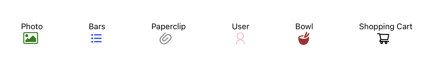
FontAwesome - photo icon, AntDesign - icon, AntDesign - paperclip icon, AntDesign - user icon, Entypo - bowl icon, AntDesign - shoppingcart icon
The Expo icons above are from @expo/vector-icons@13.0.0. Please check the @expo/vector-icons website for the full list of Expo icons.
If Expo vector icons are not working, you need to check your icon component. You can compare your component with the examples above. You should also check if you imported the icon family.
React Native Paper Library
react-native-paper library is a Material Design library. You can use its components to create a faster and more consistent design. You need to install the library with the following command:
npm install react-native-paper
You can check the full list of react-native-paper components. The older versions of Expo may require additional installation of third-party libraries. Let's see how to implement Surface, Card, and RadioButton components. You need to import the components from react-native-paper:
import { Surface, Card, Divider } from 'react-native-paper';
Expo - React Native Paper and React Native Vector Icons example
import React from "react";
import { ScrollView, Text, View } from "react-native";
import { Card, Divider, Surface } from "react-native-paper";
import { MaterialCommunityIcons } from "@expo/vector-icons";

export default function App() {
  return (
    <ScrollView>
      <View style={{ margin: 20, marginTop: 50 }}>
        <Text style={{ color: "purple", marginStart: 10, textAlign: "center", fontSize: 20, marginBottom: 20,}}>
          React Native Paper
        </Text>
        <Text style={{ color: "purple", marginStart: 10, marginLeft: 30, fontSize: 16 }}>
          •Surface:
        </Text>
        <Surface style={{ marginHorizontal: 50, marginVertical: 30, padding: 5 }} elevation={4}>
          <Text style={{ textAlign: "center" }}>Hello</Text>
        </Surface>
        <Text style={{color: "purple", marginStart: 10, marginLeft: 30, fontSize: 16, marginBottom: 10 }}>
          •Card:
        </Text>
        <Card mode="elevated" style={{ backgroundColor: "#cec1e7", marginHorizontal: 30 }}>
          <Card.Cover source={require('./image.png')} />
          <Card.Content>
            <Text style={{ color: "white", textAlign: "center", padding: 5 }}>
              Hello
            </Text>
          </Card.Content>
        </Card>
        <Text style={{color: "purple", marginStart: 10, marginTop: 20, marginLeft: 30, fontSize: 16, marginBottom: 10}}>
          •Divider:
        </Text>
        <Divider style={{ marginHorizontal: 30 }} />
        <Text style={{ color: "purple", marginTop: 20, marginStart: 10, marginLeft: 20, fontSize: 16, marginBottom: 20 }}>
          •Icons:
        </Text>
        <View style={{ marginHorizontal: 150, marginVertical: 5, marginStart: 50 }}>
          <Text>Home</Text>
          <MaterialCommunityIcons name="home" size={24} color="#3e2465" />
          <Text>Paperclip</Text>
          <MaterialCommunityIcons name="paperclip" size={24} color="#3e2465" />
        </View>
      </View>
    </ScrollView>
  );
}
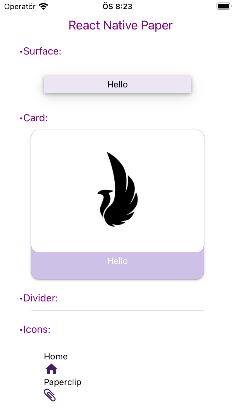
The example above is similar to the example with bare React Native. However, the setup process in bare React Native is more complex compared to Expo. Additionally, since vector icons are included by default in Expo, using Expo Vector Icons is much easier.
React Native Paper Icons, IconButton, Button
You can use the React Native Paper Icon component to create an icon. You need to import the Icon component first:
import { Icon } from 'react-native-paper';
Below, you'll find examples of how to use icons with React Native Paper in your app.
<Icon source="heart" color="red" size={24} />
<Icon source="airplane" color="blue" size={24} />
<Icon source="barcode-scan" color="black" size={24} />
<Icon source="wifi" color="black" size={24} />
<Icon source="folder-search-outline" color="black" size={24} />
<Icon source="power" color="blue" size={24} />
<Icon source="bookmark-outline" color="bookmark-outline" size={24} />
<Icon source="calendar-search" color="green" size={24} />
You can see how the icons look when displayed in the app.

Don't forget to import the Icon component. You can find the heart, airplane, barcode-scan, wifi, folder-search-outline, power, bookmark-outline, and calendar-search icons of react-native-paper above. React-Native-Paper examples with Icon component can improve your understanding.
If you need a button with an icon, you can use the IconButton component. You need to import IconButton and create an IconButton component.
import { IconButton } from 'react-native-paper';
IconButton with different icons:
<IconButton icon="camera" iconColor="black" size={20} onPress={() => console.log('Take a photo')} mode="outlined" />
<IconButton icon="alert" iconColor="red" size={20} onPress={() => console.log('Attention')} mode="contained" />
<IconButton icon="battery-charging" iconColor="grey" containerColor="lightgreen" size={20} onPress={() => console.log('Charging')} mode="contained-tonal" />
<IconButton icon="microphone" iconColor="white" containerColor="blue" size={20} onPress={() => console.log('Microphone enabled')} mode="contained-tonal" />
<IconButton icon="send" iconColor="white" containerColor="green" size={20} onPress={() => console.log('Send')} mode="contained-tonal" />
<IconButton icon="plus" iconColor="green" containerColor="lightgrey" size={20} onPress={() => console.log('Add')} mode="contained-tonal" />
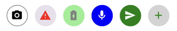
You can find the examples of the camera, alert, battery-charging, microphone, send, and plus icon buttons using the IconButton component above. You can use the mode prop to style your IconButton. There are three options: outlined, contained, and contained-tonal. You can see all three options above.
You can also use the Button component
import { Button } from 'react-native-paper';
Button component with calendar-search icon:
<Button icon="calendar-search" style={{margin: 5}} buttonColor='white' mode="contained-tonal" textColor='black' > Choose a date </Button>
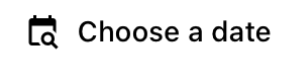
Keep in mind that you should only import a component like Button from one library at a time. For example, if you import the Button component from React Native Paper, you shouldn't also import Button from React Native or React Native Elements. Doing so can cause conflicts and result in errors. This rule applies not just to Button, but to any components with the same name across different libraries.
You can also see how to use React Native Paper Library with bare React Native.
React Native Elements
React Native Elements is a UI toolkit. It's a great tool for customizing react native apps. The usage of React Native Elements is similar to React Native Paper. You need to install the library with the following command:
npm install @rneui/themed @rneui/base
You can check the full list of react-native-elements components of React Native Elements.
Airbnb Rating, Search Bar, Avatar, Pricing Card, Social Icon examples
Let's see how to implement AirbnbRating, SearchBar, Avatar, PricingCard, SocialIcon components. You need to import the components from @rneui/themed:
import { AirbnbRating, SearchBar, Avatar, PricingCard, SocialIcon} from '@rneui/themed';
AirbnbRating
Ratings are used to receive feedback from users. There are 2 types of rating: TapRating and SwipeRating. The example below is for the Tap Rating version.
<Text> Leave feedback </Text>
<AirbnbRating
count={5}
reviews={[ 'Very Bad', 'Bad', 'Fair', 'Good', 'Great']}
defaultRating={4}
size={20} />

Users can tap stars and leave feedback.
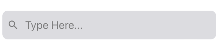
SearchBar
The SearchBar component helps to customize the search bar.
<SearchBar platform="ios" searchIcon={{name: "search", type: "materialIcons"}} placeholder="Type Here..." onClearText={() => console.log(onClearText())} cancelButtonTitle="Cancel" showCancel="False" onCancel={() => console.log(onCancel())} />
Avatar
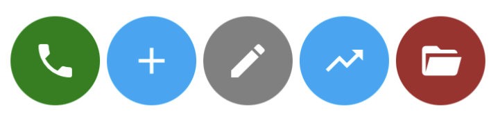
The Avator component can also be very useful for your app. Icon avatars are used in the examples below, but you can also use them to represent a user. Image avatars are also available.
<Avatar size={64} rounded icon={{ name: "phone" }} containerStyle={{ backgroundColor: "green" }} />
<Avatar size={64} rounded icon={{name: "plus"}} containerStyle={{ backgroundColor: "#00a7f7" }} />
<Avatar size={64} rounded icon={{name: "pencil"}} containerStyle={{ backgroundColor: "grey" }} />
<Avatar size={64} rounded icon={{name: "trending-up"}} containerStyle={{ backgroundColor: "grey" }} />
<Avatar size={64} rounded icon={{name: "folder-open"}} containerStyle={{ backgroundColor: "brown" }} />
PricingCard
The PricingCard elegantly displays features and prices.
<PricingCard title="Economy" price="$139*" info={['Round-trip', 'from USD 39*', 'from Seoul to Singapore']} button={{ title: 'SEARCH', icon: 'flight' }} />
How to display button icon to the right
To display the icon on the right side of a button, set the iconRight prop to true. This moves the icon (like the flight icon in the example above) to the right of the button text.
<PricingCard title="Economy" price="$139*" info={['Round-trip', 'from USD 39*', 'from Seoul to Singapore']} button={{ title: 'SEARCH', icon: 'flight', iconRight: true }} />
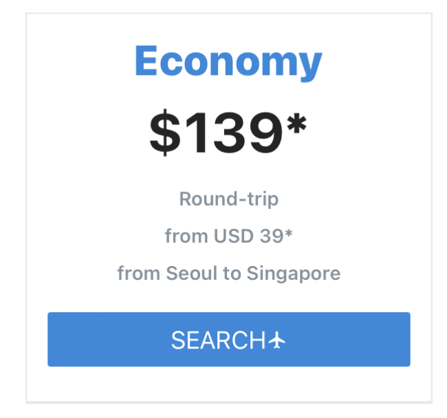
Social Icons
A SocialIcon component can create icons for social media networks. You can see how to create a SocialIcon component in the examples below.
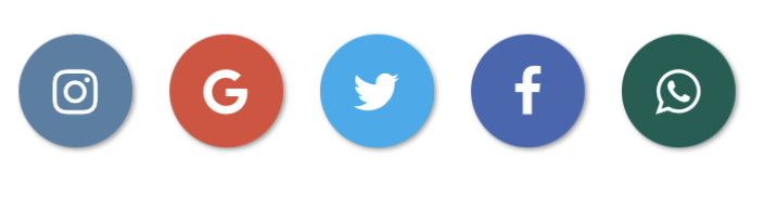
You should keep in mind that not all React Native components are implemented for the web-platform out-of-box. You may need third-party libraries to use some of the components. Please see the official documentation of React Native Elements.
You can also see how to use React Native Elements with bare React Native.
React Navigation
Learn how to set up and use React Navigation in Expo, including general navigation concepts, configuration, and usage. This tutorial also demonstrates implementing bottom tab navigation with @expo/vector-icons, highlights differences between physical devices, Expo Go, and Expo Snack, and provides practical tips for building navigable, icon-friendly Expo apps. Check out the full tutorial in our React Navigation in Expo article for step-by-step guidance.
Next Steps
You've now covered the fundamentals and important React Native Expo libraries. To explore advanced concepts, check out our separate articles covering advanced React Native Expo topics.