
React Navigation v7 in Expo: Setup, Bottom Tabs & Vector Icons
React Navigation v7 is the standard library for managing navigation in Expo and React Native applications. In this tutorial, we'll guide you through the general setup and usage of React Navigation v7, including creating bottom tab navigation and adding icons with @expo/vector-icons. By the end of this guide, you'll have a solid foundation for implementing navigation in your Expo projects and customizing it with icons.
If your app consists of more than one page, your users will need to navigate between screens. React Navigation offers different types of navigation to handle this. If you haven't set up your Expo project yet, make sure to follow the setup and installation guide before continuing. There are multiple navigator packages available, but you only need to install the specific packages you plan to use.
npx expo install @react-navigation/native
npx expo install react-native-screens react-native-safe-area-context
In the example below, we use bottom tab navigation and include icons for each tab. While you can use packages such as @react-navigation/bottom-tabs, react-native-paper, or react-native-vector-icons, this example uses @expo/vector-icons to demonstrate Expo's icon support. @expo/vector-icons is a built-in library in Expo, so you can use it immediately. However, if you want to install the latest version, you can run the following command:
npm install @expo/vector-icons
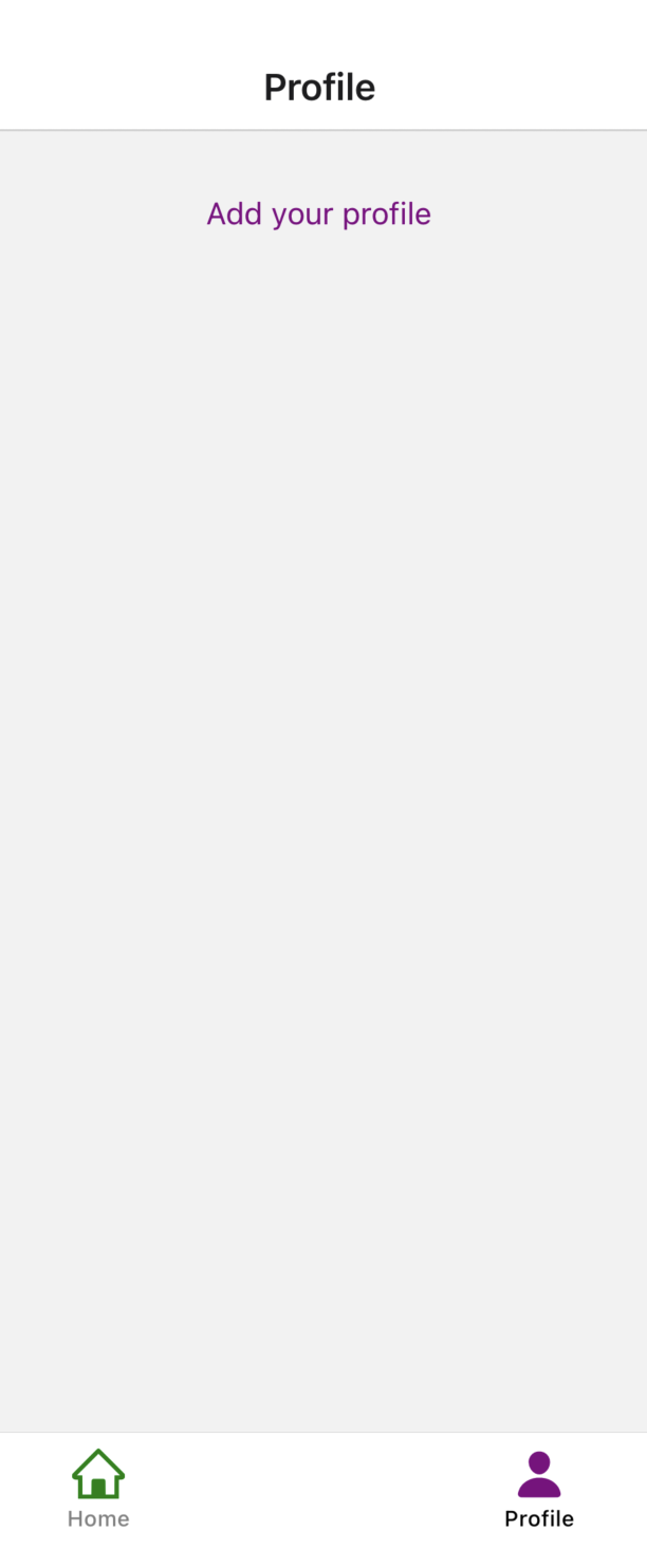
React Navigation with Expo example
import AntDesign from "@expo/vector-icons/AntDesign";
import Ionicons from "@expo/vector-icons/Ionicons";
import { createBottomTabNavigator } from "@react-navigation/bottom-tabs";
import { Text, View } from "react-native";
function HomeScreen() {
   return (
    <View style={{ textAlign: "center" }}>
      <Text style={{ textAlign: "center", marginTop: 30, color: "green" }}>
        Welcome Home
      </Text>
    </View>
  );
}

function ProfileScreen() {
  return (
    <View style={{ textAlign: "center" }}>
      <Text style={{ textAlign: "center", marginTop: 30, color: "purple" }}>
        Add your profile
      </Text>
    </View>
  );
}

const Tab = createBottomTabNavigator();

export default function App() {
  return (
    <Tab.Navigator
      screenOptions={{
        tabBarActiveTintColor: "black",
        tabBarInactiveTintColor: "grey",
      }}
    >
      <Tab.Screen
        name="Home"
        component={HomeScreen}
        options={{
          tabBarLabel: "Home",
          tabBarIcon: ({ color, size }) => (
            <AntDesign name="home" size={24} color="green" />
          ),
        }}
      />
      <Tab.Screen
        name="Profile"
        component={ProfileScreen}
        options={{
          tabBarLabel: "Profile",

          tabBarIcon: ({ color, size }) => (
            <Ionicons name="person" size={24} color="purple" />
          ),
        }}
      />
    </Tab.Navigator>
  );
}
Bottom Tabs Navigator is used for the example above. createBottomTabNavigator creates the tab you need for the bottom tabs. You need to wrap the Tab Screens with the Tab.Navigator.
@react-navigation/bottom-tabs is used in both examples below. You can see the home icon of AntDesign in the first example and the person icon of Ionicons in the second example.

This project was developed using @react-navigation/native version ^7.1.30, @react-navigation/bottom-tabs version ^7.15.1, and Expo version ~54.0.33.
You can check other Expo vector icons on the Expo Vector Icons website.
Note: The example runs successfully on a physical device and in Expo Go; however, it is not supported in Expo Snack due to environment limitations. Conversely, some examples from the official documentation work in Expo Snack but may not function properly in Expo Go. For more details, see the React Navigation official documentation.
For a deeper understanding of Expo and to explore other useful libraries, check out our Expo tutorial.