
React Native Elements Tutorial: Installation, Setup, and Popular Component Examples
Developing a modern mobile application often involves building many common UI elements from scratch, which can slow down the development process. React Native Elements is a popular cross-platform UI toolkit that helps developers build modern React Native applications faster by providing a collection of customizable, ready-to-use components. In this tutorial, you'll learn how to install and configure React Native Elements, explore commonly used components including Avatar, SearchBar, Airbnb Rating, PricingCard, and SocialIcon, and discover how it can simplify the development of beautiful and consistent mobile user interfaces.
React Native Elements is a popular UI toolkit for React Native that makes it easy to build and customize modern mobile applications with ready-made, reusable components.
Before diving into React Native Elements, make sure your React Native development environment is properly set up. If you haven't done it yet, follow our React Native installation and setup guide to get everything ready.
The usage of React Native Elements is similar to React Native Paper. You can find the React Native Elements setup for iOS below. You need to install the library with the following command:
npm install @rneui/themed @rneui/base
Then run cd ios && pod install && cd ..
You can check the full list of react-native-elements components of React Native Elements.
Airbnb Rating, Search Bar, Avatar, Pricing Card, Social Icon examples
Let's see how to implement AirbnbRating, SearchBar, Avatar, PricingCard, SocialIcon components. You need to import the components from @rneui/themed:
import { AirbnbRating, SearchBar, Avatar, PricingCard, SocialIcon } from '@rneui/themed';
AirbnbRating Example
Users can rate on the AirbnbRating. There are 2 types of rating: TapRating and SwipeRating. The example below is for Tap Rating version.
<Text> Leave feedback </Text>
<AirbnbRating
count={5}
reviews={[ 'Very Bad', 'Bad', 'Fair', 'Good', 'Great']}
defaultRating={4}
size={20} />

Users can tap stars and leave feedback.
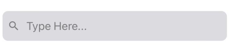
SearchBar Example
<SearchBar platform="ios" searchIcon={{name: "search", type: "materialIcons"}} placeholder="Type Here..." onClearText={() => console.log(onClearText())} cancelButtonTitle="Cancel" showCancel="False" onCancel={() => console.log(onCancel())} />
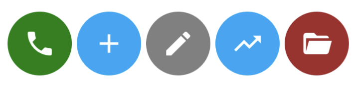
Avatar Example
<Avatar size={64} rounded icon={{ name: 'phone' }} containerStyle={{ backgroundColor: 'green' }} />
<Avatar size={64} rounded icon={{name: "plus"}} containerStyle={{ backgroundColor: '#00a7f7' }} />
<Avatar size={64} rounded icon={{name: "pencil"}} containerStyle={{ backgroundColor: 'grey' }} />
<Avatar size={64} rounded icon={{name: "trending-up"}} containerStyle={{ backgroundColor: 'grey' }} />
<Avatar size={64} rounded icon={{name: "folder-open"}} containerStyle={{ backgroundColor: 'brown' }} />
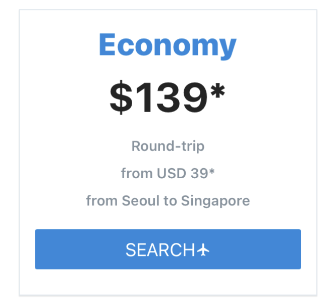
PricingCard Example
PricingCard displays features and prices in an elegant way.
<PricingCard title="Economy" price="$139*" info={['Round-trip', 'from USD 39*', 'from Seoul to Singapore']} button={{ title: 'SEARCH', icon: 'flight' }} />

How to display button icon to the right
iconRight prop displays Icon (the flight icon in the example above) to the right of the title. If you want to display the icon to the right, iconRight should be true.
<PricingCard title="Economy" price="$139*" info={['Round-trip', 'from USD 39*', 'from Seoul to Singapore']} button={{ title: 'SEARCH', icon: 'flight', iconRight: true }} />
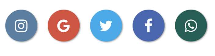
Social Icons Example
A SocialIcon component can create icons for social media networks. You can see how to create a SocialIcon component in the examples below.
React Native Elements vs React Native Paper
React Native Elements and React Native Paper are two of the most popular UI libraries for React Native, but they take different approaches to app design.
React Native Elements focuses on flexibility and ease of use. It provides a collection of ready-made components such as Avatar, SearchBar, Rating, PricingCard, and SocialIcon that can be customized to fit almost any design style. Because it is not tied to a specific design system, developers have more freedom when creating unique user interfaces.
React Native Paper is built around Google's Material Design principles. It includes Material Design components such as Buttons, Cards, Icons, and Surface, along with powerful theming capabilities. This makes it an excellent choice for applications that want a consistent Material Design experience across all screens.
Choose React Native Elements if you want a lightweight and flexible component library that can adapt to your own design language. Choose React Native Paper if you prefer a complete Material Design framework with built-in theming and design consistency.
If you'd like to learn more about Material Design components in React Native, check out our React Native Paper guide.
You don't need to install react-native-vector-icons for the examples above. However, if you want to use React Native Vector Icons with React Native Elements, you need to install React Native Vector Icons.
You can use React Native Elements with Expo as well.