
Matplotlib Tutorial 2026
2.Common Chart Types in Matplotlib (with Examples)
a.How to create a line chart with plot() in Matplotlib
b.Creating scatter plots in Matplotlib with scatter()
c.Bar charts in Matplotlib: vertical and horizontal Bars
d.How to make a pie chart in Matplotlib
e.Drawing histograms in Matplotlib with hist()
f.How to create a heatmap in Matplotlib
3.Customizing ticks with tick_params() in Matplotlib
4.How to create and arrange subplots in Matplotlib
5.Adding text and annotations in Matplotlib charts
6.Using colormaps in Matplotlib to style your plots
7.Customizing global plot styles with rcParams in Matplotlib
Matplotlib
Matplotlib is a Python library used for data visualization. It is often used with other Python libraries. Seaborn, NumPy, and Pandas libraries will be used with the Matplotlib library in the tutorial below, but you don't need to know them. If you want to learn about the Seaborn library, please visit the Seaborn tutorial. If you want to learn about the Pandas library, please visit the Pandas tutorial. If you want to learn about the NumPy library, please visit the NumPy tutorial. You can use the Matplotlib Library with the Scikit-learn library. If you want to learn about the Scikt-learn Library, please visit the Scikit-learn tutorial. If you are interested in a specific topic, you can just jump into that topic. You can use your editor to test your code.
Matplotlib is similar to the Seaborn Library, but Matplotlib offers more customization options. They are useful to represent and explain data. Visual Studio Code and Matplotlib 3.9.1 will be used for the tutorial below.
How to install Matplotlib in Python
You need to set up a virtual environment in Python. You need to install virtualenv. If you are using pip, run the command below:
pip install virtualenv
If you are using pip3, use pip3 instead of pip.
You need to create a virtual environment in your Python project folder. If you are using pip, run the command below:
python -m venv new_env
If you are using python3, use python3 instead of python. We named the virtual environment "new_env" but you can choose another name.
You can activate the environment:
source new_env/bin/activate
If you are using pip, run the command below:
pip install -U matplotlib
If you are using conda, run the command below:
conda install matplotlib
To check the version of matplotlib library:
import matplotlib
print(matplotlib.__version__)
Matplotlib 3.9.1, the latest version, will be used in the tutorial below. When you install with the command above, the latest version will be installed.
We will use seaborn, pandas, and numpy libraries. If you are using pip, run the commands below:
pip install seaborn
pip install pandas
pip install numpy
If you are using conda, run the commands below:
conda install seaborn
conda install pandas
conda install numpy
Import the seaborn and other libraries:
import pandas as pd
import seaborn as sns
import numpy as np
If you want to run the codes below without any installation, you can use Google Colab as well.
Common chart types in Matplotlib
pyplot is used for plot generation. You can use pyplot for charts, graphs, axes, and figures. You need to import the pyplot submodule for creating the following charts:
import matplotlib.pyplot as plt
Seaborn library datasets will be used in the examples below. If you want to make the same charts using Seaborn Library, please visit the Seaborn Library tutorial.
How to create a line chart with plot() in Matplotlib
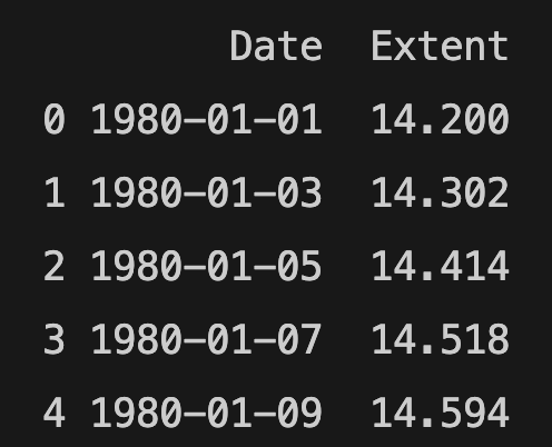
Seaborn library seaice dataset will be used for the line chart example. You can find the first 5 rows of seaice dataset:
You can use the plot function to make a line chart:
import matplotlib.pyplot as plt
import seaborn as sns
seaice = sns.load_dataset("seaice")
plt.plot(seaice["Date"], seaice["Extent"])
plt.title("Sea Ice")
plt.xlabel("Date")
plt.ylabel("Extent")
plt.show()

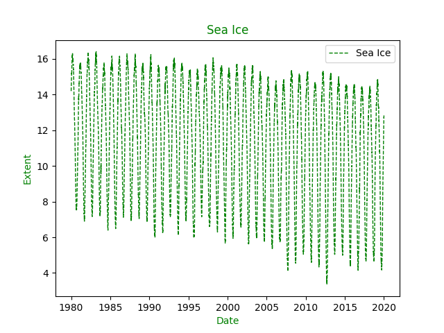
You can customize the line chart and add the legend() parameter:
import matplotlib.pyplot as plt
import seaborn as sns
seaice = sns.load_dataset("seaice")
plt.plot(seaice["Date"], seaice["Extent"], linestyle="dashed", color="green", linewidth="1")
plt.title("Sea Ice", color="green")
plt.xlabel("Date", color="green")
plt.ylabel("Extent", color="green")
plt.legend(["Sea Ice"], bbox_to_anchor=(1, 1.10))
plt.show()

bbox_to_anchor parameter helps to specify the location of legend. You can use bbox_to_anchor parameter to locate the legend outside the plot. You can use the loc parameter instead of bbox_to_anchor:
import matplotlib.pyplot as plt
import seaborn as sns
seaice = sns.load_dataset("seaice")
plt.plot(seaice["Date"], seaice["Extent"], linestyle="dashed", color="green", linewidth="1")
plt.title("Sea Ice", color="green")
plt.xlabel("Date", color="green")
plt.ylabel("Extent", color="green")
plt.legend(["Sea Ice"], loc=1)
plt.show()
You can write "upper right" instead of 1 for loc parameter. You can find the full list of loc codes on the official website.
**You can use ls for linestyle, c for color, and lw for linewidth.
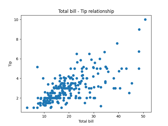
Creating scatter plots in Matplotlib with scatter()
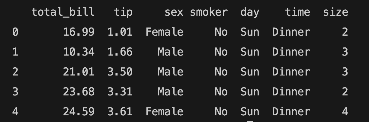
Seaborn Library tips dataset will be used for the following 2 charts. You can read the first 5 rows of the dataset:
You can use a scatter plot to the display the relationship between two numerical variables:
import matplotlib.pyplot as plt
import seaborn as sns
tips = sns.load_dataset("tips")
plt.scatter(tips["total_bill"], tips["tip"])
plt.title("Total bill - Tip relationship")
plt.xlabel("Total bill")
plt.ylabel("Tip")
plt.show()
Bar charts in Matplotlib: vertical and horizontal bars
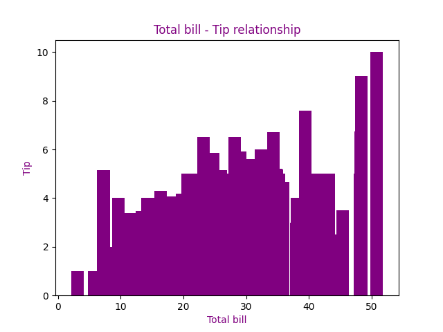
You can also make a bar chart. Let's make a bar chart with the same data:
import matplotlib.pyplot as plt
import seaborn as sns
tips = sns.load_dataset("tips")
plt.bar(tips["total_bill"], tips["tip"])
plt.title("Total bill - Tip relationship")
plt.xlabel("Total bill")
plt.ylabel("Tip")
plt.show()

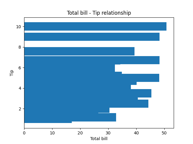
You can use horizontal bars as well:
import matplotlib.pyplot as plt
import seaborn as sns
tips = sns.load_dataset("tips")
plt.barh(tips["tip"], tips["total_bill"])
plt.title("Total bill - Tip relationship")
plt.xlabel("Total bill")
plt.ylabel("Tip")
plt.show()
You can customize your bar chart:
import matplotlib.pyplot as plt
import seaborn as sns
tips = sns.load_dataset("tips")
plt.bar(tips["total_bill"], tips["tip"], color="purple", width=2)
plt.title("Total bill - Tip relationship", color="purple")
plt.xlabel("Total bill", color="purple")
plt.ylabel("Tip", color="purple")
plt.show()
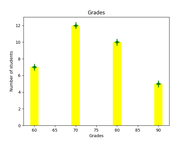
Error bars
You can also add error bars:
import matplotlib.pyplot as plt
import seaborn as sns
import numpy as np
grades = np.array([80, 60, 90, 70])
no_of_people = np.array([10, 7, 5, 12])
plt.bar(grades, no_of_people, color="yellow", width=2)
plt.title("Grades")
plt.xlabel("Grades")
plt.ylabel("Number of students")
plt.errorbar(grades, no_of_people, xerr=0.6, yerr=0.4, fmt="o", color="green", lw=2)
plt.show()
How to make a pie Chart in Matplotlib
You can use plt.pie to make a pie chart. Let's make a basic pie chart:
import matplotlib.pyplot as plt
import seaborn as sns
import numpy as np
scores = np.array([30, 30, 25, 15])
grades = ["A", "B", "C", "D"]
plt.pie(scores, labels=grades)
plt.title("Grades")
plt.show()

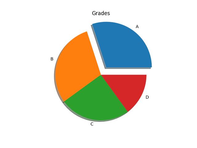
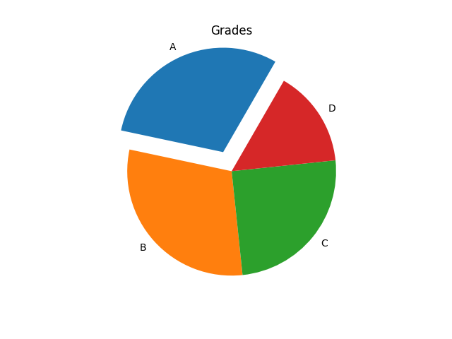
You can also create a pie chart using the explode and shadow parameters. The explode parameter offsets one or more slices to highlight them, as shown in the example below. You can also add a drop shadow to the chart using the shadow parameter.
import matplotlib.pyplot as plt
import seaborn as sns
import numpy as np
scores = np.array([30, 30, 25, 15])
grades = ["A", "B", "C", "D"]
test_explode = [0.2, 0, 0, 0]
plt.pie(scores, labels=grades, explode=test_explode, shadow=True)
plt.title("Grades")
plt.show()
You can also specify the start angle using startangle parameter. startangle parameter shows the start point of the pie chart:
import matplotlib.pyplot as plt
import seaborn as sns
import numpy as np
scores = np.array([30, 30, 25, 15])
grades = ["A", "B", "C", "D"]
test_explode = [0.2, 0, 0, 0]
plt.pie(scores, labels=grades, explode=test_explode, startangle=60)
plt.title("Grades")
plt.show()
Drawing histograms in Matplotlib with hist()
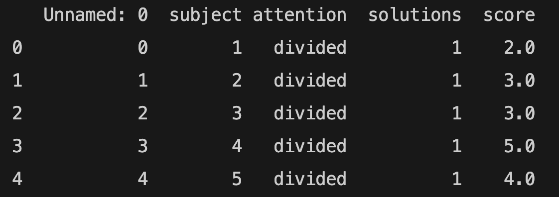
Let's see the attention dataset of the Seaborn library:
A histogram is a graph showing frequency distributions:
import matplotlib.pyplot as plt
import numpy as np
import seaborn as sns
score = sns.load_dataset("attention")
plt.hist(score["score"], color="green")
plt.title("Scores", color="green")
plt.show()

How to Create a Heatmap in Matplotlib
You can create a heatmap in Matplotlib using a 2D list or array that defines the data to be color-coded.
import matplotlib.pyplot as plt
import numpy as np
foods = np.array([
"pizza",
"pasta",
"lunch box",
"ice cream",
"coffee"
])
number_of_orders = np.array([[7, 8, 9, 12, 4],
[6, 5, 12, 4, 3],
[3, 5, 7, 9, 12],
[4,2, 7, 10, 15],
[6, 8, 12,9,7]])
days = ["Monday", "Tuesday", "Wednesday", "Thursday", "Friday"]
fig, ax = plt.subplots()
im = ax.imshow(number_of_orders, cmap="RdBu")
ax.set_xticks(np.arange(len(days)), labels=days)
ax.set_yticks(np.arange(len(foods)), labels=foods)
plt.setp(ax.get_xticklabels(), rotation=45, ha="right", color="purple",
rotation_mode="anchor")
plt.setp(ax.get_yticklabels(), rotation=45, ha="right", color="purple",
rotation_mode="anchor")
for i in range(len(foods)):
for j in range(len(days)):
text = ax.text(j, i, number_of_orders[i, j],
ha="center", va="center", color="w")
ax.set_title("Food orders")
ax.set_xlabel("Days")
ax.set_ylabel("Foods")
fig.tight_layout()
plt.show()

The example above shows the number of food orders from Monday to Friday. To draw a Matplotlib heatmap, ax.imshow is used and the amount of orders is used as values. For example, 7 pizzas are ordered on Monday. plt.setp method is used to customize labels for the x and y axes, we can rotate, align, and color the labels. cmap parameter is used for the Matplotlib heatmap and RdBu colormap is applied. Colormaps are widely used in heatmaps. To customize the heatmap, you can add labels. ax.set_xticks for days and ax.set_yticks for food names are used. ax.set_title displays the title of the heatmap. ax.set_xlabel displays "Days" title for x axis, ax.set_ylabel displays "Foods" title for y axis. You can find another heatmap example in the colormap section.
You can learn more about colormaps.
You can draw a heatmap with seaborn using the same data as well.
Customizing ticks with tick_params() in Matplotlib
You can also use tick_params() to customize axes. You can change the appearance of ticks, tick labels, and gridlines.
import matplotlib.pyplot as plt
import numpy as np
days = np.array(["Monday", "Tuesday", "Wednesday", "Thursday", "Friday", "Saturday", "Sunday"])
no_of_clients = np.array([10, 27, 35, 42, 50, 50, 45])
plt.bar(days, no_of_clients, color="#97DC96", width=2)
plt.title("Client numbers per day")
plt.xlabel("Days")
plt.ylabel("Number of clients")
plt.tick_params(axis='x', direction='out', color='red', labelsize='large', labelcolor='purple', labelrotation=30)
plt.show()
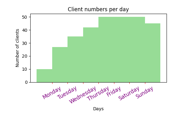
You can specify the axis, labelsize, labelcolor, direction, and labelrotation parameters. You can add tick_params for the y axis as well. Let's also add tick_params for the y-axis, and modify some parameter values for the x-axis:
import matplotlib.pyplot as plt
days = np.array(["Monday", "Tuesday", "Wednesday", "Thursday", "Friday", "Saturday", "Sunday"])
no_of_clients = np.array([10, 27, 35, 42, 50, 50, 45])
plt.bar(days, no_of_clients, color="#97DC96", width=2)
plt.title("Client numbers per day")
plt.xlabel("Days", color="purple")
plt.ylabel("Number of clients", color="purple")
plt.tick_params(axis='x', direction='in', color='purple', labelsize='large', labelcolor='purple', labelrotation=30)
plt.tick_params(axis='y', direction='in', color='purple', labelsize='large', labelcolor='purple', labelrotation=60)
plt.show()

plt.bar helps to customize the chart's bars. It is used to specify the color and the width of the bars. plt.title is used to add a title. You can also add a label for x and y axes, you can use the color parameter to change the color of the labels. plt.tick_params are used to change the appearance of ticks, tick labels, and gridlines. You can change the direction of the ticks with the direction parameter. You can also rotate labels with labelrotation like in the example above.
How to create and arrange subplots in Matplotlib
Let's remember the "tips" dataset:
Subplots help visualize different plots in one figure. You can create different types of graphs for the same variables, or use different variables or datasets to generate new visualizations.
import matplotlib.pyplot as plt
import seaborn as sns
tips = sns.load_dataset("tips")
fig = plt.figure(figsize = (12, 10), tight_layout = True)
fig.subplots_adjust(hspace = 0.5, wspace = 0.20)
plt.subplot(3, 2, 1)
plt.bar(tips["size"], tips["total_bill"], color="purple", width=0.5)
plt.xlabel("size")
plt.ylabel("Total Bill")
plt.subplot(3, 2, 2)
plt.scatter(tips["size"], tips["tip"])
plt.legend(["size"])
plt.xlabel("size")
plt.ylabel("Total Bill")
plt.subplot(3, 2, 3)
plt.pie(tips["tip"])
plt.xlabel("day")
plt.ylabel("Total Bill")
plt.subplot(3, 2, 4)
plt.hist(tips["time"])
plt.xlabel("sex")
plt.ylabel("Total Bill")
plt.subplot(3, 2, 5)
plt.bar(tips["smoker"], tips["total_bill"])
plt.xlabel("smoker")
plt.ylabel("Total Bill")
plt.show()
Matplotlib subplot (pyplot.sublot())

You can see the plt.sublot(x, y, z) syntax in the example above. The first argument specifies the number of rows, the second specifies the number of columns, and the third indicates the index of the current plot. For example, plt.subplot(3, 2, 3) creates a figure with 3 rows and 2 columns, and places the current plot in the third position. You can alternatively write the total number of plots instead of rows. For example, you can write plt.subplot(5, 2, 3) instead of plt.subplot(3, 2, 3).
It's similar to the seaborn library's pairplot() function.
Adding text and annotations in Matplotlib charts
You can use plt.annotate() to add annotation:
import matplotlib.pyplot as plt
days = [1, 2, 3, 4, 5,6,7]
amounts = [10, 20, 30, 40, 50, 60, 70]
plt.plot(days, amounts, marker='o', linestyle='-', color='blue')
plt.annotate('The point', xy=(3, 30), xytext=(2, 35), arrowprops=dict(facecolor='black', arrowstyle='->'), fontsize=10)
plt.xlabel('X-axis')
plt.ylabel('Y-axis')
plt.title('The point')
plt.show()
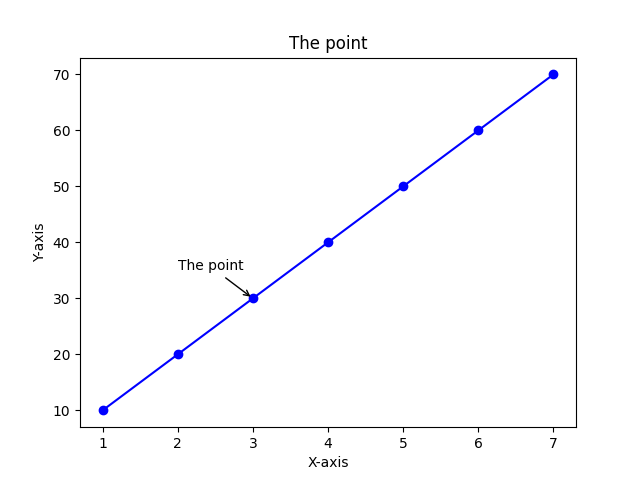
xy parameter shows the location of the point. xytext parameter shows the location of the text. facecolor parameter specifies the color and arrowstyle parameter specifies the style of the arrows.
Using colormaps in Matplotlib to style your plots
You can choose colormaps in Matplotlib. There are many options and you can choose the palette you want. Matplotlib colormap has several categories: sequential, diverging, cyclic, and qualitative. You can get a list of all registered colormaps:
from matplotlib import colormaps
print(list(colormaps))
You can find all Matplotlib colormaps below:
['magma', 'inferno', 'plasma', 'viridis', 'cividis', 'twilight', 'twilight_shifted', 'turbo', 'Blues', 'BrBG', 'BuGn', 'BuPu', 'CMRmap', 'GnBu', 'Greens', 'Greys', 'OrRd', 'Oranges', 'PRGn', 'PiYG', 'PuBu', 'PuBuGn', 'PuOr', 'PuRd', 'Purples', 'RdBu', 'RdGy', 'RdPu', 'RdYlBu', 'RdYlGn', 'Reds', 'Spectral', 'Wistia', 'YlGn', 'YlGnBu', 'YlOrBr', 'YlOrRd', 'afmhot', 'autumn', 'binary', 'bone', 'brg', 'bwr', 'cool', 'coolwarm', 'copper', 'cubehelix', 'flag', 'gist_earth', 'gist_gray', 'gist_heat', 'gist_ncar', 'gist_rainbow', 'gist_stern', 'gist_yarg', 'gnuplot', 'gnuplot2', 'gray', 'hot', 'hsv', 'jet', 'nipy_spectral', 'ocean', 'pink', 'prism', 'rainbow', 'seismic', 'spring', 'summer', 'terrain', 'winter', 'Accent', 'Dark2', 'Paired', 'Pastel1', 'Pastel2', 'Set1', 'Set2', 'Set3', 'tab10', 'tab20', 'tab20b', 'tab20c', 'grey', 'gist_grey', 'gist_yerg', 'Grays', 'magma_r', 'inferno_r', 'plasma_r', 'viridis_r', 'cividis_r', 'twilight_r', 'twilight_shifted_r', 'turbo_r', 'Blues_r', 'BrBG_r', 'BuGn_r', 'BuPu_r', 'CMRmap_r', 'GnBu_r', 'Greens_r', 'Greys_r', 'OrRd_r', 'Oranges_r', 'PRGn_r', 'PiYG_r', 'PuBu_r', 'PuBuGn_r', 'PuOr_r', 'PuRd_r', 'Purples_r', 'RdBu_r', 'RdGy_r', 'RdPu_r', 'RdYlBu_r', 'RdYlGn_r', 'Reds_r', 'Spectral_r', 'Wistia_r', 'YlGn_r', 'YlGnBu_r', 'YlOrBr_r', 'YlOrRd_r', 'afmhot_r', 'autumn_r', 'binary_r', 'bone_r', 'brg_r', 'bwr_r', 'cool_r', 'coolwarm_r', 'copper_r', 'cubehelix_r', 'flag_r', 'gist_earth_r', 'gist_gray_r', 'gist_heat_r', 'gist_ncar_r', 'gist_rainbow_r', 'gist_stern_r', 'gist_yarg_r', 'gnuplot_r', 'gnuplot2_r', 'gray_r', 'hot_r', 'hsv_r', 'jet_r', 'nipy_spectral_r', 'ocean_r', 'pink_r', 'prism_r', 'rainbow_r', 'seismic_r', 'spring_r', 'summer_r', 'terrain_r', 'winter_r', 'Accent_r', 'Dark2_r', 'Paired_r', 'Pastel1_r', 'Pastel2_r', 'Set1_r', 'Set2_r', 'Set3_r', 'tab10_r', 'tab20_r', 'tab20b_r', 'tab20c_r', 'rocket', 'rocket_r', 'mako', 'mako_r', 'icefire', 'icefire_r', 'vlag', 'vlag_r', 'flare', 'flare_r', 'crest', 'crest_r']
To use the colormap, you should use cmap parameter.
Reverse colormap
If you want to reverse the order of your Matplotlib color palette, you can add the suffix "_r":
im = ax.imshow(number_of_orders, cmap="RdBu_r")
Let's draw a heatmap using a colormap:
import matplotlib.pyplot as plt
import numpy as np
from numpy import random
list = random.randint(100, size=(5,5))
plt.imshow(list, cmap="PuBu")
plt.colorbar()
for i in range(len(list)):
for j in range(len(list[i])):
plt.text(j, i, list[i,j], ha="center", va="center", color="black")
plt.show()

Let's reverse the Matplotlib colormap for the heatmap above:
import matplotlib.pyplot as plt
from numpy import random
list = random.randint(100, size=(5,5))
plt.imshow(list, cmap="PuBu_r")
plt.colorbar()
for i in range(len(list)):
for j in range(len(list[i])):
plt.text(j, i, list[i,j], ha="center", va="center", color="black")
plt.show()

To see all the colors, colormaps, and categories, you can visit the Matplotlib webpage.
Customizing global plot styles with rcParams in Matplotlib
rcParams is a dictionary-like object in Matplotlib that lets you set default styles for your plots. Let's see how to use it:
import matplotlib.pyplot as plt
plt.rcParams['figure.figsize'] = (10, 5)
plt.rcParams['axes.titlesize'] = 16
plt.rcParams['axes.labelsize'] = 14
plt.rcParams['lines.linewidth'] = 2
It's useful for consistent styling. It applies to all plots after it's set.