
Seaborn Tutorial
2.Seaborn Datasets
3.Seaborn plotting functions
4.Visualizing statistical relationships with Seaborn
a. seaborn.lineplot
b. seaborn.scatterplot
5.Visualizing distributions of data with Seaborn
a. seaborn.histplot
b. seaborn.kdeplot
c. seaborn.pairplot
d. seaborn.jointplot
6.Visualizing categorical data with Seaborn
a. seaborn.boxplot
b. seaborn.barplot
7.Querying in Seaborn
8.Seaborn Heatmap
Seaborn Tutorial 2026
Seaborn is a Python library for making statistical graphics, and visualizing data. Matplotlib and Pandas libraries will be used, but you don't need to know them. If you are interested in a specific topic, you can just jump into that topic. You can use Seaborn Library with other Python libraries. If you want to learn the Pandas library, please visit the Pandas tutorial. If you need more customized graphs and charts, you can check Matplotlib Tutorial. If you want to learn about the Numpy Library, please visit the Numpy Tutorial. If you want to learn about the Scikit-learn library, please visit the Scikit-learn tutorial. You can use your editor to test your code. The Seaborn 0.13.2 will be used for the tutorial below.
Seaborn Installation
You need to set up a virtual environment in Python. You need to install virtualenv. If you are using pip, run the command below:
pip install virtualenv
If you are using pip3, use pip3 instead of pip.
You need to create a virtual environment in your Python project folder. If you are using pip, run the command below:
python -m venv new_env
If you are using python3, use python3 instead of python. We named the virtual environment "new_env" but you can choose another name.
You can activate the environment:
source new_env/bin/activate
If you are using pip, run the command below:
pip install seaborn
If you are using conda, run the command below:
conda install seaborn -c conda-forge
To check the version of seaborn library:
import seaborn as sns
print(sns.__version__)
NumPy, pandas and matplotlib are other essential Python libraries required for the course below.. If you are using pip, run the commands below:
pip install numpy
pip install pandas
pip install matplotlib
If you are using conda, run the commands below:
conda install numpy
conda install pandas
conda install -c conda-forge matplotlib
Import the seaborn and other libraries:
import matplotlib.pyplot as plt
import seaborn as sns
import numpy as np
If you want to run the codes below without any installation, you can use Google Colab as well.
Seaborn Datasets
You can use Pandas DataFrame or Seaborn datasets to practice. We will use Seaborn built-in datasets. You can explore seaborn datasets list:
import matplotlib.pyplot as plt
import seaborn as sns
print(sns.get_dataset_names())
You can choose and load one of them:
tips = sns.load_dataset("tips")
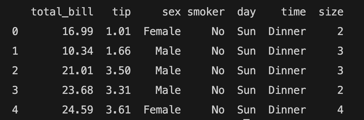
You can load the "tips" dataset with the method above. You can use the info() method to learn more about the dataset or the head() method to read the first 5 rows. Unlike pandas, you need to use the print() function:
print(tips.head())
The datasets of seaborn library 0.13.2:
['anagrams', 'anscombe', 'attention', 'brain_networks', 'car_crashes', 'diamonds', 'dots', 'dowjones', 'exercise', 'flights', 'fmri', 'geyser', 'glue', 'healthexp', 'iris', 'mpg', 'penguins', 'planets', 'seaice', 'taxis', 'tips', 'titanic']
Seaborn plotting functions
According to the official documentation of the seaborn library, there are figure-level and axes-level functions. There are 3 figure-level functions: relplot (relational), displot (distributions), and catplot (categorical). Relational plots are scatterplot and lineplot. Displots are histplot, kdeplot, ecdfplot, rugplot, distplot(deprecated). Categorical plots are catplot, stripplot, swarmplot, boxplot, violinplot, boxenplot, pointplot, barplot, countplot. Pair grids are pairplot and PairGrid. Joint grids are jointplot and JointGrid.
Visualizing statistical relationships with Seaborn
We will be using the "tips" dataset for relplot() and scatterplot() functions. The "dowjones" dataset will be used for lineplot(). You can find the first 5 rows of the "tips" dataset below:
The sns.relplot() function is used to plot relational data involving multiple variables, such as 'total_bill' and 'tip'. For example, you can use the relplot() function with the tips dataset like this:
import matplotlib.pyplot as plt
import seaborn as sns
tips = sns.load_dataset("tips")
sns.relplot(kind='scatter', data=tips, x='total_bill', y='tip')
plt.show()
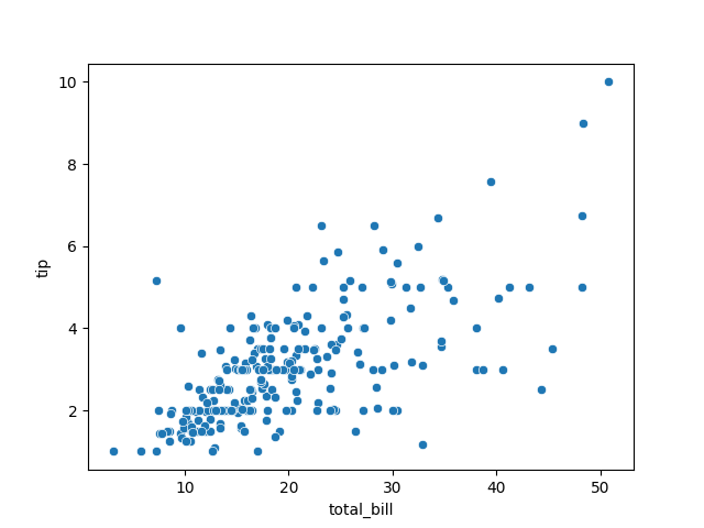
The example above shows the relationship between "total_bill" (x axis) and the "tip" (y axis) with scatter plotting. It's the general syntax of relational plotting.
You can achieve the same result using the scatterplot() function.
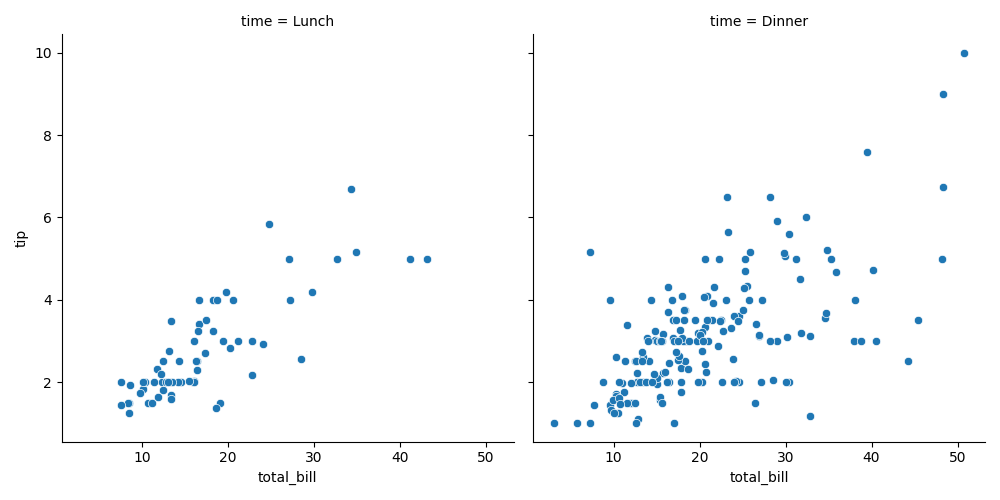
If the 'time' variable is assigned to the col parameter, it will create 2 graphs for 'Lunch' and 'Dinner':
import matplotlib.pyplot as plt
import seaborn as sns
sns.relplot(kind='scatter', data=tips, x='total_bill', y='tip', col="time")
plt.show()
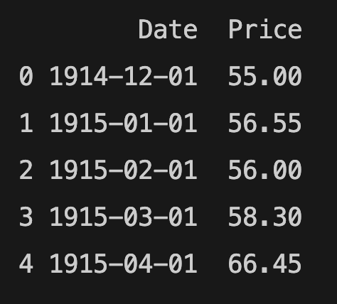
You can find the first 5 rows of the "dowjones" dataset below:
import matplotlib.pyplot as plt
import seaborn as sns
dj = sns.load_dataset("dowjones")
sns.relplot(kind='line', data=dj, x='Date', y='Price')
plt.show()
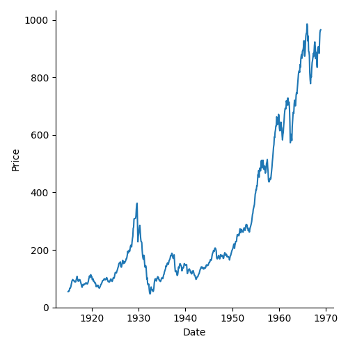
You can get the same result with the lineplot() function.
seaborn.lineplot
You can also use the sns.lineplot() function to achieve a similar result, using the following syntax:
import matplotlib.pyplot as plt
import seaborn as sns
dj = sns.load_dataset("dowjones")
sns.lineplot(data=dj, x="Date", y="Price")
plt.show()
seaborn.scatterplot
You can get the same result with the scatterplot() function:
import matplotlib.pyplot as plt
import seaborn as sns
tips = sns.load_dataset("tips")
sns.scatterplot(data=tips, x="total_bill", y="tip")
Visualizing distributions of data with Seaborn
Visualizing distributions of data helps us to understand how the variables are distributed. The axes level functions are histplot(), kdeplot(), rugplot(), ecdfplot(). The figure-level function of visualizing a distribution is displot():
import matplotlib.pyplot as plt
import seaborn as sns
tips = sns.load_dataset("tips")
sns.displot(tips, x="total_bill", hue="time")
plt.show()
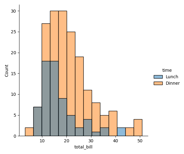
The displot() example above shows the distribution of "total_bill" data. The hue parameter is used to display the time ("Lunch" or "Dinner") of the data.
seaborn.histplot
A histogram is used to show the distribution of one or several numerical variables. You can use histplot function to create a histogram in seaborn:
import matplotlib.pyplot as plt
import seaborn as sns
tips = sns.load_dataset("tips")
sns.histplot(tips, x="total_bill")
plt.show()
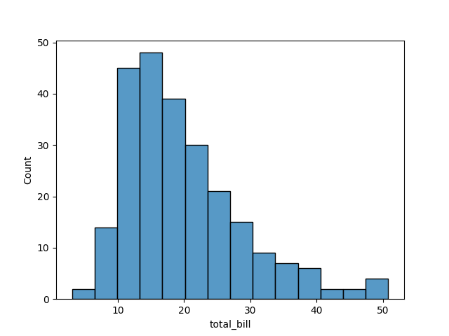
y axis shows the distribution of "total_bill" that falls within discrete bins. It's similar to displot() function.
seaborn.kdeplot
The kernel density estimate (KDE) plot is similar to histplot, but it represents the data using a continuous probability:
import matplotlib.pyplot as plt
import seaborn as sns
tips = sns.load_dataset("tips")
sns.kdeplot(data=tips, x="total_bill")
plt.show()
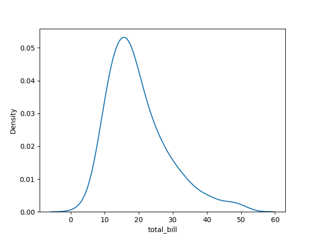
While a histogram displays the distribution of "total_bill" by counting the number of observations in each bin, the KDE plot (Kernel Density Estimation) shows a smoothed estimate of the distribution of "total_bill".
seaborn.pairplot
The pairplot() function shows pairwise relationships between variables in a dataset.
import matplotlib.pyplot as plt
import seaborn as sns
tips = sns.load_dataset("tips")
sns.pairplot(tips)
plt.show()
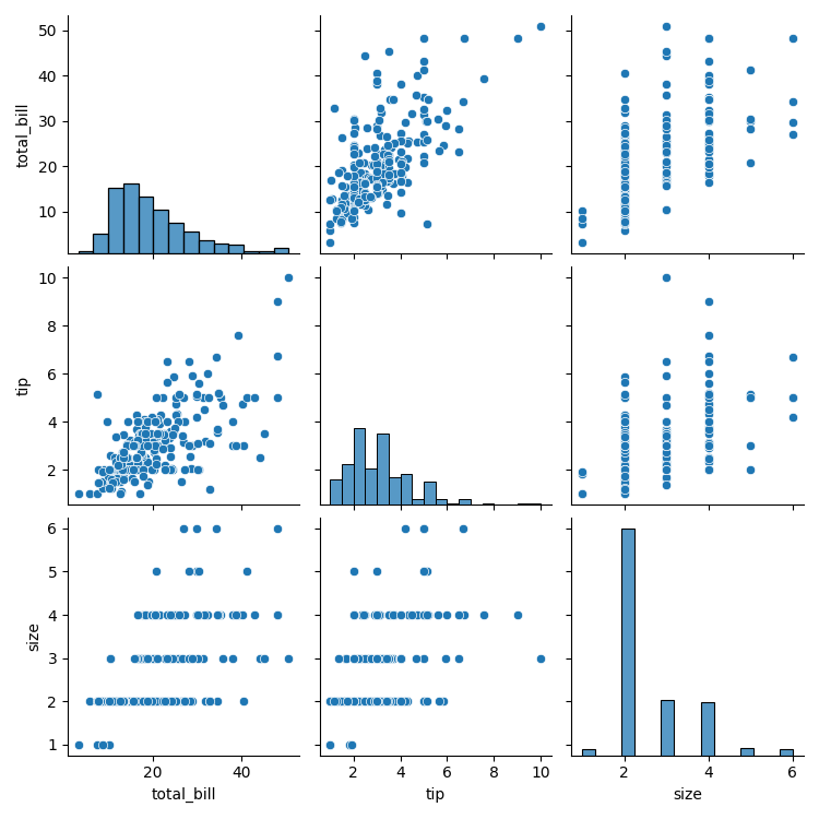
The pairplot() function shows the relationships among the 'size', 'tip', and 'total_bill' (numerical) variables.
seaborn.jointplot
import matplotlib.pyplot as plt
import seaborn as sns
tips = sns.load_dataset("tips")
sns.jointplot(data=tips, x="total_bill", y="tip")
plt.show()
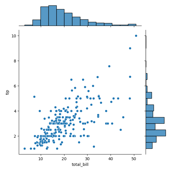
The jointplot() example shows the relationship between total_bill and tip using a scatter plot with marginal histogram. If we want to see the effect of 'time' variable, we can add 'time' variable as a hue parameter:
import matplotlib.pyplot as plt
import seaborn as sns
tips = sns.load_dataset("tips")
sns.jointplot(data=tips, x="total_bill", y="tip", hue="time")
plt.show()
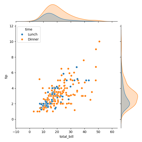
The example above is like a scatter plot, but it also draws separate density curves using kdeplot().
Visualizing categorical data with Seaborn
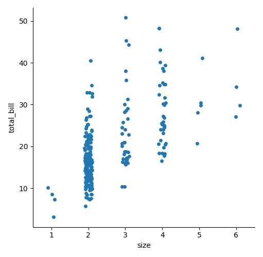
Visualizing categorical data is similar to visualizing relational data, but there is a key difference: Relational plots focus on the relationship between two numerical variables, while categorical plots are used to explore relationships involving categorical variables. Categorical scatterplots are stripplot(), swarmplot(). Categorical distribution plots are boxplot(), violinplot(), boxenplot(). Categorical estimate plots are pointplot(), barplot(), countplot(). The figure-level interface of categorical data is catplot():
import matplotlib.pyplot as plt
import seaborn as sns
tips = sns.load_dataset("tips")
sns.catplot(tips, x="size", y="total_bill")
plt.show()
You can add a hue parameter and change the kind to box:
import matplotlib.pyplot as plt
import seaborn as sns
tips = sns.load_dataset("tips")
sns.catplot(tips, x="size", y="total_bill", kind="box", hue="time")
plt.show()
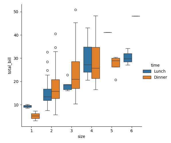
seaborn.boxplot
boxplot() makes a box plot to show distributions with respect to categories:
import matplotlib.pyplot as plt
import seaborn as sns
tips = sns.load_dataset("tips")
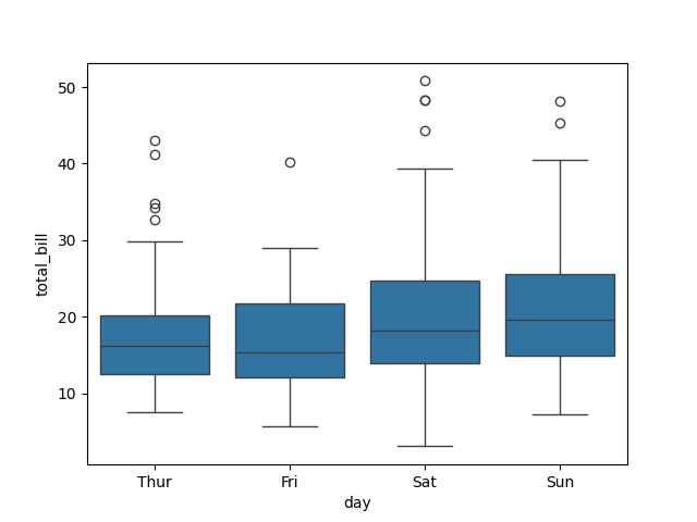
sns.boxplot(data=tips, x='day', y="total_bill")
plt.show()
seaborn.barplot
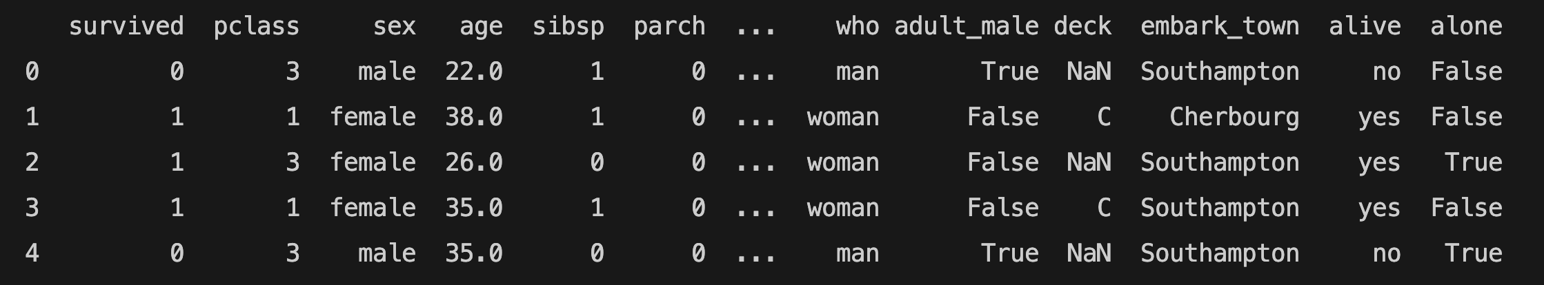
Let's remember the "titanic" dataset:
barplot() shows the estimate (taking the mean by default) and the error bars. The error bars show 95% confidence intervals by default.
import seaborn as sns
import matplotlib.pyplot as plt
titanic = sns.load_dataset('titanic')
sns.barplot(data=titanic, x='pclass', y="survived")
plt.show()
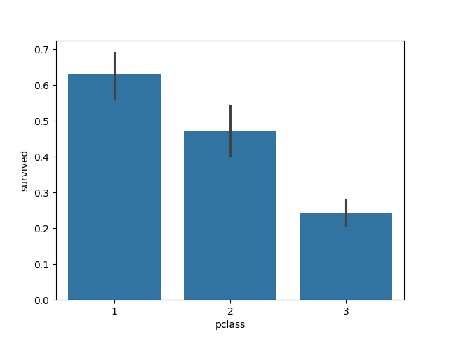
The graph above shows the relationship between the classes of the Titanic (pclass) and the survival rate. The first class passengers have a higher survival rate.
Querying in Seaborn
If you want to filter the data with a query, you can use the query() method:
import seaborn as sns
import matplotlib.pyplot as plt
tips = sns.load_dataset("tips")
sns.catplot(data = tips.query("time == 'Dinner'"), x="size", y="total_bill", hue="sex")
plt.show()
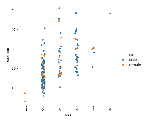
The function above only shows the "Dinner" time results. You can see the 'size', the 'total_bill', and the 'sex' ('male' and 'female' customers represented separately) variables for the dinner.
Seaborn Heatmaps
sns.heatmap is an axes-level function to plot rectangular data as a color-encoded matrix. You need a 2D list or array to draw a heatmap.
import matplotlib.pyplot as plt
import numpy as np
import seaborn as sns
import pandas as pd
foods = np.array([
"pizza",
"pasta",
"lunch box",
"ice cream",
"coffee"
])
days = ["Monday", "Tuesday", "Wednesday", "Thursday", "Friday"]
number_of_orders = pd.DataFrame([[7, 8, 9, 12, 4],
[6, 5, 12, 4, 3],
[3, 5, 7, 9, 12],
[4,2, 7, 10, 15],
[6, 8, 12,9,7]], columns=days)
number_of_orders.index = foods
ax = sns.heatmap(number_of_orders, annot=True)
ax.set(xlabel="Days", ylabel="Foods")
ax.set_title("Food Orders")
plt.show()
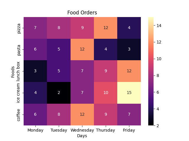
number_of_orders is the 2-dimensional list created by pandas DataFrame. It shows the number of orders from Monday to Friday. The x-axis displays the 'Days' using the columns parameter. The y-axis displays the foods using the index parameter. For example, the total number of coffee orders is 6 on Monday. The annot parameter displays the data values in each cell when set to True. You can also use xlabel and ylabel parameters to write a label for the x and y axes. set_title() sets a title for the Axes. You can draw the same heatmap using the Matplotlib library as well.
You can also add a colormap:
import matplotlib.pyplot as plt
import numpy as np
import seaborn as sns
import pandas as pd
foods = np.array([
"pizza",
"pasta",
"lunch box",
"ice cream",
"coffee"
])
days = ["Monday", "Tuesday", "Wednesday", "Thursday", "Friday"]
number_of_orders = pd.DataFrame([[7, 8, 9, 12, 4],
[6, 5, 12, 4, 3],
[3, 5, 7, 9, 12],
[4,2, 7, 10, 15],
[6, 8, 12,9,7]], columns=days)
number_of_orders.index = foods
ax = sns.heatmap(number_of_orders, annot=True, cmap="viridis")
ax.set(xlabel="Days", ylabel="Foods")
ax.set_title("Food Orders")
plt.show()
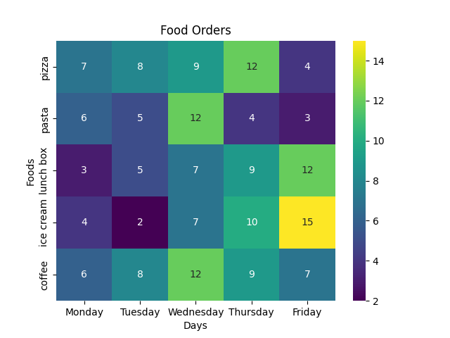
You can find all the registered colormaps in the Matplotlib webpage. To learn more about Matplotlib colormaps, visit the Matplotlib webpage.